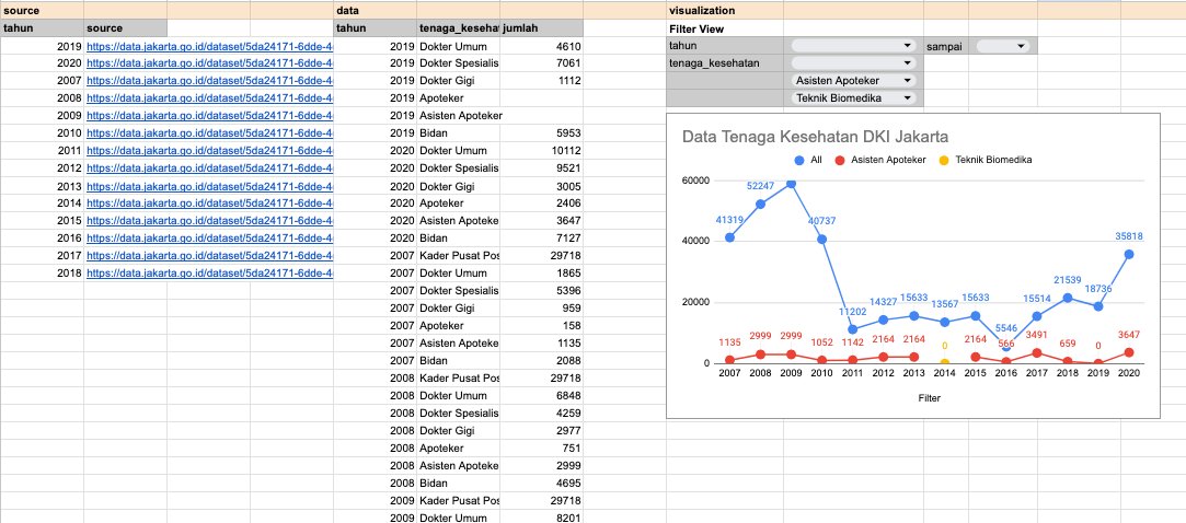
This project is similar project with project #001, but it’s more simple and straightforward. I’ve made a dashboard that contains a filter view and a simple line chart that shows the numbers of medical workes in Jakarta, Indonesia.
The source of this project is Open Data Jakarta that contains the datasets from 2007-2020.
Actually, this project can be made simpler using Slice and Pivot Table for the filter view. But, I think using native-only formulas is more customizable and user-friendly.

Anyway, this is the link if you want to copy this project yourself. Cheers!